PA - Preferred Skin ?
-
Ahem!
Nothing wrong with my understanding. :p
Looking into things and picking them apart to look clever . :) thanks Luxor
-
@Sir:
Looking into things and picking them apart to look clever . :) thanks Luxor
Picking apart? :confused:
-
Luxor :) you make me smile at times. Thats all that you need to know.
PS: Do you have your forum set to not show when your online?? because whenever you reply your forum light is on red. Yet at the bottom of the forum start page it says your currently online :D
-
@Sir:
Luxor :) you make me smile at times. Thats all that you need to know.
Aw, shucks! :o :D
@Sir:
PS: Do you have your forum set to not show when your online?? because whenever you reply your forum light is on red. Yet at the bottom of the forum start page it says your currently online :D
Can’t remember to be honest.<runs off=“” to=“” check=“”>
Yes I’m Invisible. Ready to pounce from the shadows when required. :D</runs> -
Ahh gotcha! It just helps when i can see green because i know how soon i need to bother to reply to a message :) or how long to wait till i reply :D
If it wasnt for being on these forums for so many years and understanding how to check if your online without the green light im sure that “Pounce” would un nerve my slightly.
However, as you un nerve me anyway it doesnt really matter. :D
-
@Sir:
If it wasnt for being on these forums for so many years and understanding how to check if your online without the green light im sure that “Pounce” would un nerve my slightly.
However, as you un nerve me anyway it doesnt really matter. :D
You’re not the first to say that Richard. :D
-
you know i was just about to post a poll on our Facebook page.
I feel that time has come for Modern interface to shine.
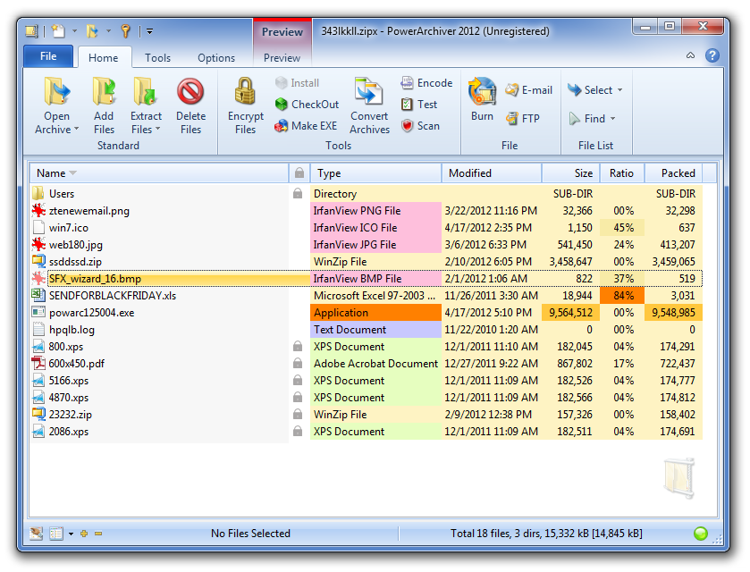
We simplified it in PA 2012 a bit yet made it more advanced :-).Question is NOT what you guys like - you guys can change your setting anytime. Question is what average joe prefers - he gives PA one chance and does not know to change skins.
So will the new modern interface with no default preview but with Preview smart tab and color coding be too much? Or will it be easier to use than before?
-
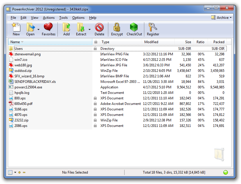
two very different sides to PA 2012 :-)
-
p.s. Richard - our Classic works on any Windows OS and our Ribbon works on any Windows OS… you dont have to limit it to XP or Win7.
p.p.s. There are over 20 skins, 5 per page :P
-
p.s. Richard - our Classic works on any Windows OS and our Ribbon works on any Windows OS… you dont have to limit it to XP or Win7.
p.p.s. There are over 20 skins, 5 per page :P
“SIGH” :rolleyes: I wasnt reffering towards “compatibility” but visually styled… classic is like XP. and modern like vista, windows 7 & 8.
reference the skins… do appologies… i shall amend.
So we have more old style skins and significantly less modern.2012 Looking Good ;)
-
So will the new modern interface with no default preview but with Preview smart tab and color coding be too much? Or will it be easier to use than before?
Notm sure what the smart tab is? Is that the coloured Preview beside the QAT? I just think that looks confusing.
Also shouldn’t those zip files be coloured? Preview supports Zip.
-
I think the idea of a Smart Preview Tab is a good idea and concept! something that can be expanded on.
Also it is similar to Office when you select a file such as a picture a new Tab appear enabling you to alter the picture.
So you are keeping powerarchiver coherent with a international office application.
Thats good for business and home users too.
The question should be, if the user doesnt like the smart tab is it possible they can turn it off and switch to the old preview screen???
ow and to clarifiy before i get it in the neck from you guys “again” im not complaining… i personaly am happy with a preview tab… but until get to test the program in real life i cant say for sure. I am just asking a question and suggesting a possible solution.
-
Notm sure what the smart tab is? Is that the coloured Preview beside the QAT? I just think that looks confusing.
Also shouldn’t those zip files be coloured? Preview supports Zip.
smart/conextual tab turn on based on what file you have opened and/or selected.
i have it in mind to add tools tab for instance as well, that would show tools applicable, used on that file you have opened.
-
@Sir:
I think the idea of a Smart Preview Tab is a good idea and concept! something that can be expanded on.
Also it is similar to Office when you select a file such as a picture a new Tab appear enabling you to alter the picture.
So you are keeping powerarchiver coherent with a international office application.
Thats good for business and home users too.
The question should be, if the user doesnt like the smart tab is it possible they can turn it off and switch to the old preview screen???
ow and to clarifiy before i get it in the neck from you guys “again” im not complaining… i personaly am happy with a preview tab… but until get to test the program in real life i cant say for sure. I am just asking a question and suggesting a possible solution.
sure, you can leave preview always on… smart tab just give you bigger area to work with than that tiny toolbar we had on the top of preview…
so basically gives you easy access to preview when you need it and more screen space when you dont.
-
as part of Win8, Windows Explorer will have similar contextual tabs that show up depending on what file we selected… it makes sense, very simple to use while keeping you with all the options.
-
now the question was - is new PA 2012 interface with color coding too complicated looking at start to be default?
-
now the question was - is new PA 2012 interface with color coding too complicated looking at start to be default?
Speaking for myself, no it doesn’t look too complicated at all.
-
Speaking for myself, no it doesn’t look too complicated at all.
it is mostly about color coding… some people will like it, some wont… if we make it optional, nobody will ever use it.
-
it is mostly about color coding… some people will like it, some wont… if we make it optional, nobody will ever use it.
Those who don’t like it can disable it if it bothers them. For that reason I would go with it being the default layout. I would guess that a lot of folk will find the colour coding useful and if it’s not default then some would never know it’s available.
-
it is mostly about color coding… some people will like it, some wont… if we make it optional, nobody will ever use it.
For the 1st time in ages i agree with Luxor… :)
It isnt too complex and if you want users to have a feel for something new sometimes you need to push them in that direction so they get to experience it.
I’ve spoken to a few freinds from work about this feature and they suggested it was a good idea to enable an adaptive colour scheme for Archives.
One area I would suggest, and have done in the past was a more advanced search engine that incorporated additional filters.
Now you have colour schemes it would be great if that was a filter within the search Dialog.
This then gives user a more adaptive, dynamic interface with coherent search and filter system.