PA - Preferred Skin ?
-
So will the new modern interface with no default preview but with Preview smart tab and color coding be too much? Or will it be easier to use than before?
Notm sure what the smart tab is? Is that the coloured Preview beside the QAT? I just think that looks confusing.
Also shouldn’t those zip files be coloured? Preview supports Zip.
-
I think the idea of a Smart Preview Tab is a good idea and concept! something that can be expanded on.
Also it is similar to Office when you select a file such as a picture a new Tab appear enabling you to alter the picture.
So you are keeping powerarchiver coherent with a international office application.
Thats good for business and home users too.
The question should be, if the user doesnt like the smart tab is it possible they can turn it off and switch to the old preview screen???
ow and to clarifiy before i get it in the neck from you guys “again” im not complaining… i personaly am happy with a preview tab… but until get to test the program in real life i cant say for sure. I am just asking a question and suggesting a possible solution.
-
Notm sure what the smart tab is? Is that the coloured Preview beside the QAT? I just think that looks confusing.
Also shouldn’t those zip files be coloured? Preview supports Zip.
smart/conextual tab turn on based on what file you have opened and/or selected.
i have it in mind to add tools tab for instance as well, that would show tools applicable, used on that file you have opened.
-
@Sir:
I think the idea of a Smart Preview Tab is a good idea and concept! something that can be expanded on.
Also it is similar to Office when you select a file such as a picture a new Tab appear enabling you to alter the picture.
So you are keeping powerarchiver coherent with a international office application.
Thats good for business and home users too.
The question should be, if the user doesnt like the smart tab is it possible they can turn it off and switch to the old preview screen???
ow and to clarifiy before i get it in the neck from you guys “again” im not complaining… i personaly am happy with a preview tab… but until get to test the program in real life i cant say for sure. I am just asking a question and suggesting a possible solution.
sure, you can leave preview always on… smart tab just give you bigger area to work with than that tiny toolbar we had on the top of preview…
so basically gives you easy access to preview when you need it and more screen space when you dont.
-
as part of Win8, Windows Explorer will have similar contextual tabs that show up depending on what file we selected… it makes sense, very simple to use while keeping you with all the options.
-
now the question was - is new PA 2012 interface with color coding too complicated looking at start to be default?
-
now the question was - is new PA 2012 interface with color coding too complicated looking at start to be default?
Speaking for myself, no it doesn’t look too complicated at all.
-
Speaking for myself, no it doesn’t look too complicated at all.
it is mostly about color coding… some people will like it, some wont… if we make it optional, nobody will ever use it.
-
it is mostly about color coding… some people will like it, some wont… if we make it optional, nobody will ever use it.
Those who don’t like it can disable it if it bothers them. For that reason I would go with it being the default layout. I would guess that a lot of folk will find the colour coding useful and if it’s not default then some would never know it’s available.
-
it is mostly about color coding… some people will like it, some wont… if we make it optional, nobody will ever use it.
For the 1st time in ages i agree with Luxor… :)
It isnt too complex and if you want users to have a feel for something new sometimes you need to push them in that direction so they get to experience it.
I’ve spoken to a few freinds from work about this feature and they suggested it was a good idea to enable an adaptive colour scheme for Archives.
One area I would suggest, and have done in the past was a more advanced search engine that incorporated additional filters.
Now you have colour schemes it would be great if that was a filter within the search Dialog.
This then gives user a more adaptive, dynamic interface with coherent search and filter system.
-
@Sir:
For the 1st time in ages i agree with Luxor… :)
It isnt too complex and if you want users to have a feel for something new sometimes you need to push them in that direction so they get to experience it.
I’ve spoken to a few freinds from work about this feature and they suggested it was a good idea to enable an adaptive colour scheme for Archives.
One area I would suggest, and have done in the past was a more advanced search engine that incorporated additional filters.
Now you have colour schemes it would be great if that was a filter within the search Dialog.
This then gives user a more adaptive, dynamic interface with coherent search and filter system.
search and filter system? :-)
Richard always add few new things to the list…
-
search and filter system? :-)
Richard always add few new things to the list…
I’ve noticed that many of those things ive added over the 6 years have found themselves into the PowerArchiver Application. :)
And as a developer myself i know your work is never done. Everytime you finish one job it can open up several other adjustments, additions etc.
…. But, if its a problem i can always keep my thoughts to myself. ;)
-
@Sir:
I’ve noticed that many of those things ive added over the 6 years have found themselves into the PowerArchiver Application. :)
And as a developer myself i know your work is never done. Everytime you finish one job it can open up several other adjustments, additions etc.
…. But, if its a problem i can always keep my thoughts to myself. ;)
bring it on.
-
Thats the Developers Spirit i like to see!! and thats why you have my support :)
Looking forward to testing Alpha 2012!
-
Hi!
So will the new modern interface with no default preview but with Preview smart tab and color coding be too much? Or will it be easier to use than before?
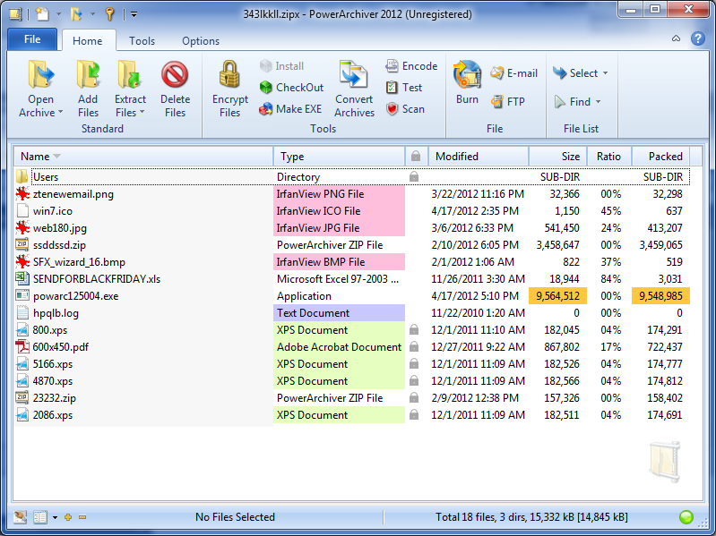
Personally, it feels like the colors is way too much I it really doesn’t help me at all when I look in the filelist of the Archive. There are too many different colors in the list and if I would have to choose between the clean white background of the filelist or the one you have with different colors, I would choose the clean white background.
If I have understand this correctly, the user will have the option of turning these colors off and use the white background instead and the question is if the colors should be turned on by default. I think it would be better if they where turned off by default. If you choose to have different colors in the filelist then I have a suggesion of how you could improve this.
Let the user have 3 different settings for the color coding of the filelist.
- Same as you have in your screenshot with colors for filetype, maxsize, maxcompression etc.
- No colors at all with white background (default settings)
- User defined color coding of the list.
With user defined color coding, the user can choose to set a color for a specified filetype and then the whole row will have the same background color.
Example: If I choose to have all files in the archive that have the .xps fileextension set as lightblue, then the filelist will have white background for all the files except for the one that have this extension.
The filelist will be easier to read with only one color of each row instead of different colors in different columns of the same row
Kind Regards
Micke
-
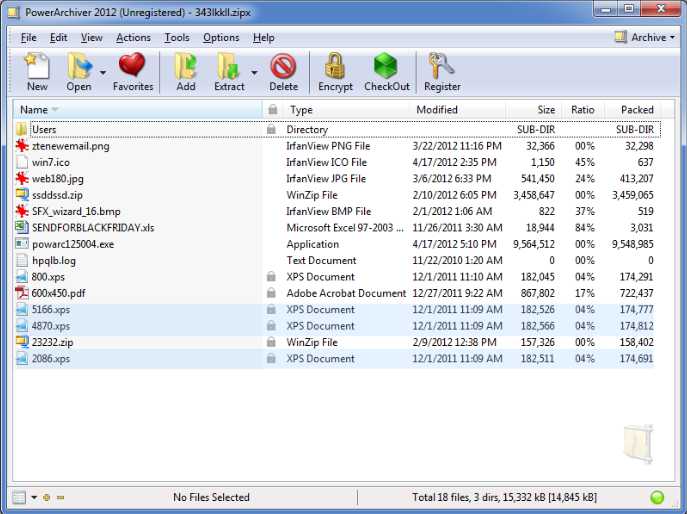
those options already exist :-)
you can turn it off, turn it on and manually color different groups. -
like this……
-
TOP Notch!
Especially when im emailing and archiving backups of Database’s with Spreadsheets and txt files in sub folder groupings…
To be able to visually see the difference and not having to check the words for formats is a top idea.
And it is a Fact that the human brain recognises Images and Colours significantly faster than words and numbers.
-
maybe when alpha/beta is out you guys can send in your suggestions for default colors
-
maybe when alpha/beta is out you guys can send in your suggestions for default colors
Anything but pink & green. :D